Welcome to another fun Furniture Friday!
This one is a looooong time in coming, and I am SO excited to finally be able to share it!
When we lived in Ottawa (so, like 2.5 years ago?) I found this fabulous wall unit second hand for a steal of a deal and just had to have it. I know most family rooms are centred around a TV in terms of furniture layout, but I like the option of being able to close the TV away and forget about it.
When I bought the unit, we were living in a shoebox and bringing it home meant pushing our couches right up to touch it and leaving about 12 square feet of floor space in our living room/dining room/play room. But I had plans.
I wanted to paint and distress the unit, but living on the second floor of an apartment with unpredictable elevator service certainly didn’t lend itself to such an undertaking, also because the bulk of this piece is made of real wood and it is HEAVY.
When it came time to move across the country to BC, along came our TV unit.
Everywhere we’ve lived with it (3 places now), it’s been a massive piece that I’ve never been quite happy with. I absolutely loved the closing doors and the storage and display capacities, but it was always just a bit too imposing, a bit too close to our flooring colour, and a bit too shiny and new looking.
Naturally, as with most projects, it is suddenly decided that “NOW” is the time to do it, so this was carted downstairs to the garage before I could get a proper “before” picture, so you’ll have to get an idea from these random shots that feature it as a background player. Had I known it would linger for another 3 months in the garage before it got painted, maybe I would’ve tried harder to get that picture :)
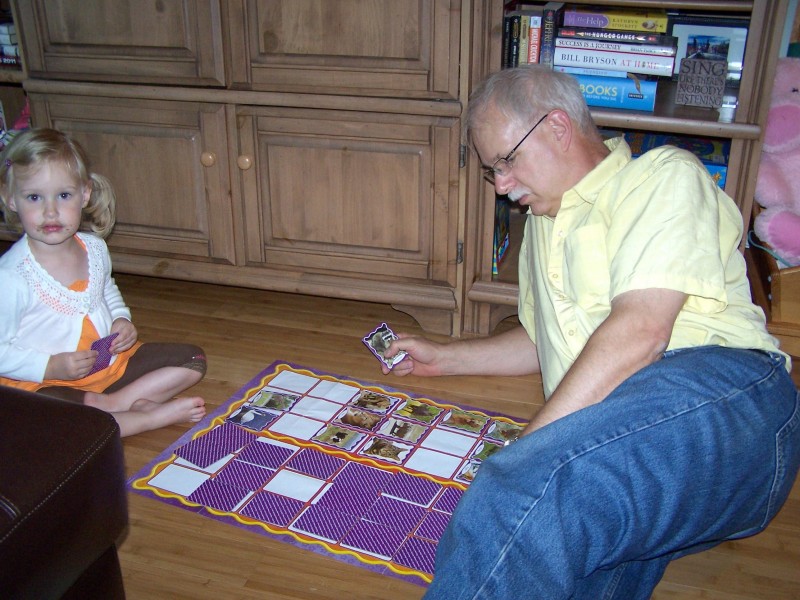
My little girl with a dirty face playing cards with her Babu :) Note the strange brown colour and matching door knobs on the unit behind them…

The big imposing brown side of the unit greeted entrants to our living room…as did melodious recorder music.
When it comes to decorating, there are many things I love about many styles, but for my own home I most love the lived-in, distressed, well-loved look of a modern country style. I love spending time in homes where books and magazines are piled on end tables; where pieces of nature mingle with modern accessories; where cat hair is not the end of the world; where I can smell something delicious cooling on the counter; where I can curl my feet up under me on the couch and grab a chunky knit blanket to cuddle in. These things feel like home to me.
Bit by bit, we’re getting there.
Being married means there will be compromises, like our large leather sectional that is too modern for my tastes but which calls my husband’s name. Being on a budget also means compromises, like plain beige couches bought second hand rather than white and bright floral fabric couches.
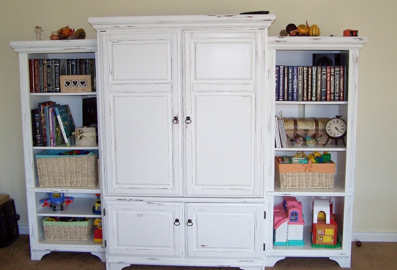
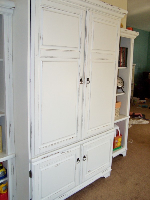
But this cabinet is now exactly what I had envisioned, and to me it cheers up the whole living room in our home. The whiteness of it makes it much less imposing, and there is less of a feeling of living in a desert, where everything is shades of brown as far as the eye can see. The white makes a fresh backdrop for the books and toys that needed a home, and the handles are the perfect finishing touch. If you’re curious as to the steps, they’re listed at the end of the post – for those who, like me, really care most about the end result, here it is…with extra things already accumulating on top, as tends to happen on any surface in my home :)
While the upper cupboards hide the TV, the lower cupboards also come in handy for the kids’ puzzles, movies, and games.
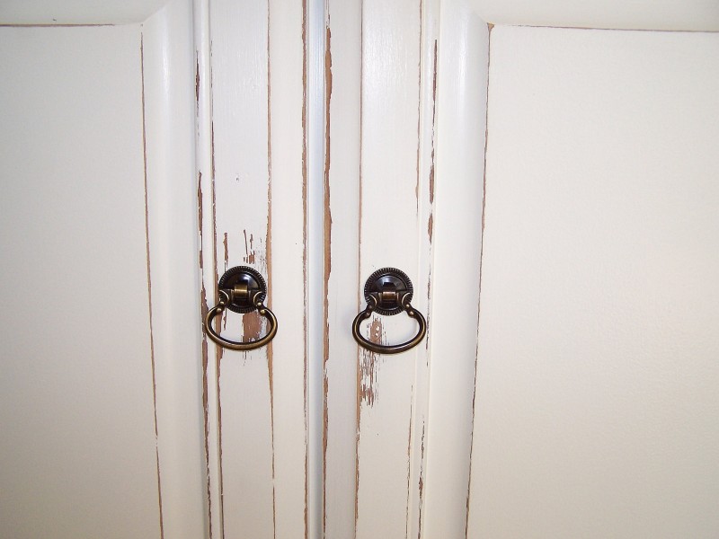
A little extra rubbing around the handles gives the look of extended use. Carl lobbied for lion’s head door knockers, but I’m glad we stuck with classic and simple :)
So if you’re interested, this is how we did it!
We opted to skip primer on this piece because I knew I wanted to distress it and previous experience had taught me that priming makes the paint a little too durable and distressing becomes an extremely difficult chore with heavy sanding needed. Instead, we went with a self-priming paint, Benjamin Moore’s Aura, in a satin finish.

We sanded the unit lightly to help the paint adhere, then painted 2 coats of Aura on the whole thing, sanding again between coats to ensure the smoothest finish. The colour I chose was AF-20 (Mascarpone), a clean, warm white that isn’t too stark against the creamy butter colour behind it, Windham Cream.


Carl initially tried spraying it, but with limited space and working in semi-darkness with one fluorescent bulb, this proved too challenging so it was decided to go the standard brush-and-roll route for the second coat.
I then sanded down the edges with 80 grit sandpaper – quite rough, but it made the job quick and painless! I didn’t do any distressing on the tops, sides, or shelves, as I knew regular use would take their toll on these areas since we had skipped the primer. With the baskets of kids’ toys being pulled off and on multiple times daily, I am already starting to see slight wear on the paint on those shelves, which is perfect.
So what do you think? Better before, or better after? Should I have stained it darker instead, or primed and painted and left out the distressing? I know furniture like this is a personal taste thing, so I’m not offended if you don’t like it :) Either way, thanks for looking, and have a great weekend!


It looks wonderful! What type of sandpaper did you use between coats of paint?
Thanks so much!
I used 150 grit – anything from 100 to 200 would be fine! The heavier 50 or 80 grit is good for taking the paint off for the distressing part.
I remember when you guys got this… it’s looking super! Great job, Anna:)
Great job!!
You and your sanding :). You know what else makes for a used look? Crayon marks. (Go kids!)
But MY kids would never do that…clearly your little one is out of hand already ;) And I believe you are to thank for helping Carl cart this home for me – thank you!
You did a wonderful job on this! Love how it looks! Want to come and makeover some of my furniture?! :)
Thanks Jessica! I love doing it, it makes such a big change for so little money :)
looks great!